Buckle in, friends, because this blog post is way cool. It is fascinating! And I didn’t write it. Boo. My next blog will be this fascinating, I promise (disclaimer: as long as you consider trips to the circus as fascinating as I do). Below is a blog post by the fabulous Tina Pham of Joie Studios. I knew this stuff was time consuming, but I had no idea just how time and labor intensive letterpress actually is. I loved learning about it. Enjoy!
*as a side note, Tina’s prices are very competitive and they are especially good right now as she has a “No on 8” promotion sale going on until October 31 where you can get 25% off orders. Hello!*
Anatomy of a Custom Letterpress Baby Shower Invitation
by Tina Pham
Here is Joie Studio’s first anatomy lesson, where I’ll take you through the making of a custom letterpress baby shower invitation from start to finish. Here at Joie Studio, we meld old and new letterpress techniques to get our desired results, and this baby shower invitation, more than many other projects here at the studio, showcases the different techniques we use, making it a great project to use for our anatomy lesson.
Concept
This project is actually for a very dear friend of mine, so Rebecca, the host of the baby shower, gave me a free rein to do whatever I wanted. I knew that the couple were decorating the nursery with a hippo theme, and as there is a hippo in Joie Studio’s upcoming baby line, I decided that it would be the perfect design.
The hippo is part of a safari group that was created and illustrated by the ever talented artist Matt Cox. I laid out the shower invite digitally to figure out how the layout and spacing. Here is the digital proof:
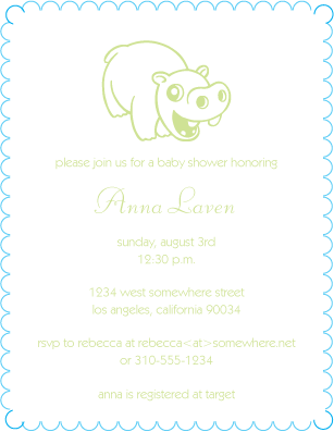
The fonts in the proof are Kabel and Liberty. Kabel is the digital version of Sans Serif Light, and Liberty is a variation of Bernhard Cursive. Both these fonts are fonts that I have handset type for.
Setting the Forme
Here at Joie Studio, we use a combination of handset type and magnesium plates to letterpress our projects.
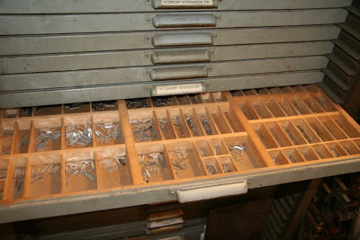
To set it, you would take each letter out, one by one, and set it on a line. Time consuming, but I think that handset type gives the best result so I keep as many fonts as I can fit into my type cabinet. The case above is pretty empty, but some of the other drawers weigh as much as 50 lbs.
As space is a major consideration and setting type is majorly time consuming, we also use metal plates. The metal plates are etched from digital files that we send to the engraver’s. We used to have our metal plates mounted on wood and we still use a lot of our plates that we had made that way: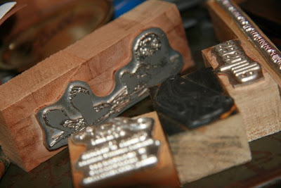
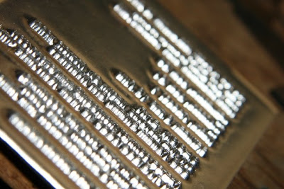
I found, however, that I wasn’t happy with the natural variations of the wood mount. As it’s an organic material, wood will expand and contract depending on weather conditions, and with letterpress, even 1/1000 of a difference will translate onto paper. Sometimes it’s ok, sometimes it’s not. So now we order unmounted metal plates with a deeper etch that we mount onto a metal base. The deeper etch also allows us to give a deeper impression to our clients who want to go as deep as possible. Here’s a closeup of an unmounted metal plate:
 For this project, we used a combination of handset type for the text and a metal plate for the hippo illustration. Once the type is set, I use wood pieces called furniture to lock the set type into the chase (which is the frame that fits into the press). What is to be printed, once set, is called the forme, shown below:
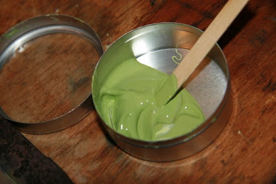
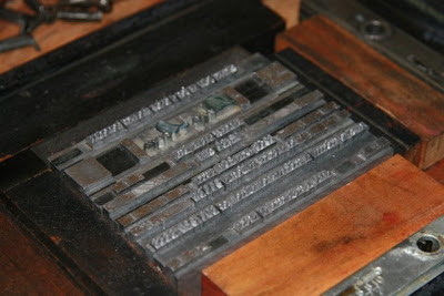 Most ink colors are handcrafted by yours truly. Sage is a color that I use a lot so whenever I mix sage, I try to make a bunch extra. For letterpress, you don’t use very much ink at all during a run. I store handcrafted inks in little 2oz tins, and as you can tell, I rarely mix that much ink, and this amount will last me through at least 2 more jobs:
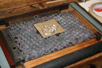
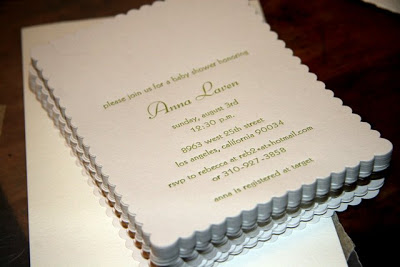 It’s still missing the hippo. The hippo is on an unmounted metal plate. To print the plate, it is first locked into a metal base, also known as a honeycomb or patent base:
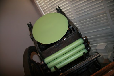
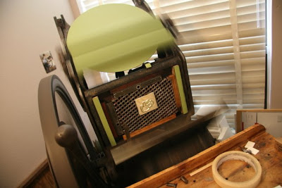 Notice the roller bearers on both sides? The bearers keep the rollers inking the forme properly, which is essential for gorgeous letterpress printing.
The Result
Here is the result of all that hard work: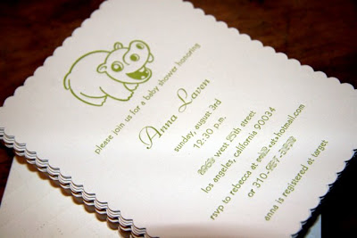
I hope you love the result as much as I did, and I hope you enjoyed a peak at our letterpress process from concept to creation. The LUXE letterpress launch has taken up so much of my time that now that it’s launched, I can turn my attention to debuting these gorgeous letterpress animals. Keep on the lookout for more animals in Joie Studio’s upcoming baby line!
+ COMMENTS
add a comment